
Manic Design (for Life)
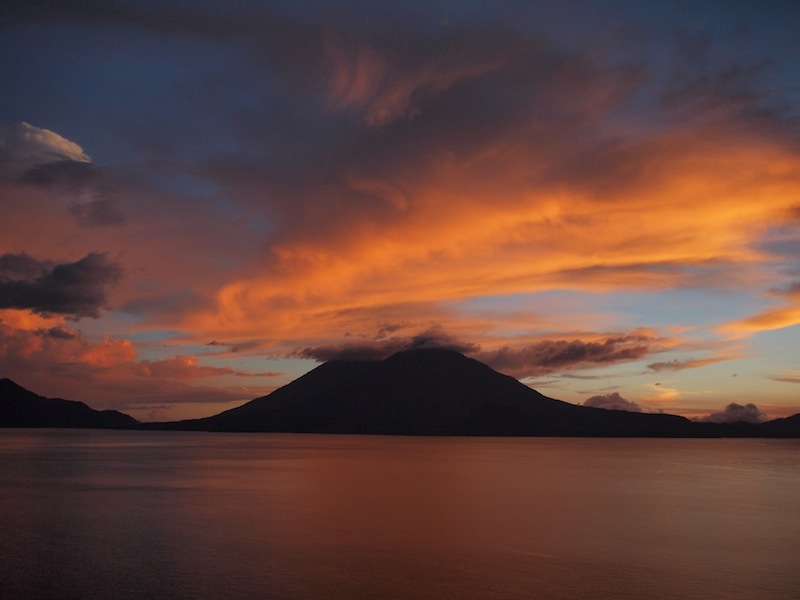
During the past few weeks, as I’ve sat gazing at Lake Atitlán’s unworldly sunsets, feeling the breath of the Earth caressing my wayward soul, there has been one thought circling around my dazzled mind:
“Damn it, I really need to change Lunaguava’s design…”
We published our first post back in March 2013, still unsure of what would become of our lives and our travel website. Fast-forward to December 2013: we’re now enjoying Guatemala’s colors and flavors, while I’m spending way too much time trying to understand Social Media.
What started out as a somewhat chaotic memory hub for past holidays in exotic lands soon became a fickle document chronicling ongoing travels through the Americas. Once a decision was made to take the blogging world a bit more seriously (mezcal is apparently conducive to megalomania), my poor excuse for a brain began to be assaulted by a nagging suspicion it was doing everything wrong.
Old rambling posts awash with underwhelming photos were forgotten in the dark recesses of the interwebs, luckily for the most part unread. A couple of these lost narratives were later resurrected and updated, since we felt they had potential and shouldn’t be relegated to the dustbin.
Nonetheless, the website itself felt old and stagnant. Given my descent into social media madness, our stories and tips were now being read by more than 3 people (we’re currently on 5 – staggering growth, I know), which in turn lead to an increasing sense of existential malaise and intellectual miasma.
No, wait, I was thinking of something else there…
What became apparent was a need for a dramatic change in how we presented ourselves to the outside world – and in what way it would contribute to our sharing of travel tales.
Hence, we are proud to present a completely new Lunaguava. The photos are still a bit shady, and the general narrative is constantly punctuated by deplorable examples of lazy writing, but the colors are brighter and the layout simpler, hopefully making the whole experience captivating (or at least bearable).
We hope the design is pleasing to old and new visitors, and are looking forward to know how long it will be until the bells of discontent start ringing again. I give it 6 months.
Please let us know your thoughts concerning this major event in world history in the comment section below. Gracias!


I’m liking it! It’s clean and simple, and navigation is intuitive. Congrats!
Many gracias, Deia! Like in life, some of the simplest things are the hardest to do, and this baby took me a while… But clean and simple is what I was going for, so I’m glad you liked it. Good luck!
Guys, this looks great! I love the frozen header and how clean the whole design is. My only suggestion would be to make the center box with the text a little narrower…. I usually say 600-700 pixels is optimal for reading–much more than that and your reader is going back and forth a lot. I realize it resizes based on screen, so on small screens it’s probably ideal, but on my laptop its currently 960px which is a bit too wide, although this is mainly my opinion so feel free to disregard. 🙂
(Also, ps, you’re hilarious.)
Thanks a lot, Syd! The frozen header meant quite a few hours struggling with GIMP. A proper web designer would make the whole thing in 5 minutes… I get the concern about the gigantic size of the text window, but we’ve grown to love it – hope our readers do too, eventually 🙂 Also, changing it would involve fidgeting with CSS and whatnot, and I’m currently too scared to mess with anything – not after dealing with the usual random issues arising from a completely new theme. Gracias for stopping by and good luck!
I’m loving your “You may also like” feature at the bottom. How did you do that, is it a plugin?
Hola Linda! The “You May Also Like” feature is native to our new theme – no plugin necessary. We really like it as well – it was one of the theme’s main selling points 🙂
Great work on the design, it’s easy to read, navigate and I love yellow 🙂
Thanks a lot for the input, Sarah-Jane! Much appreciated – and we’re happy you are fond of yellow 🙂